Headstone Ideas by Style, Colour and Shape
One photo can reveal what you are looking for better than dozens of model names. Explore examples from Rubi’s work, with notes on what gives each its character: shape, stone, inscription or a personal detail.
Contents 12 sections
Look at the Design, Not Just Its Name
“Bespoke”, “simple” and “luxury” can mean different things to different families. Here, examples are arranged by visible features: a light, uncluttered slab, a sculpted upright, a natural boulder, an inscription layout or a meaningful detail. This makes it easier to point to something specific and say what you like.
These photographs show individual commissions, not standard products with identical specifications. Each was made for a particular plot and inscription; a photo alone cannot establish size, cost or burial type. Take a design direction—or just one detail—as a starting point for your own project.
To learn how to narrow your reference photographs, continue tothe guide to comparing memorial examples. This guide introduces the styles themselves. Use the contents to go straight to the direction that interests you.
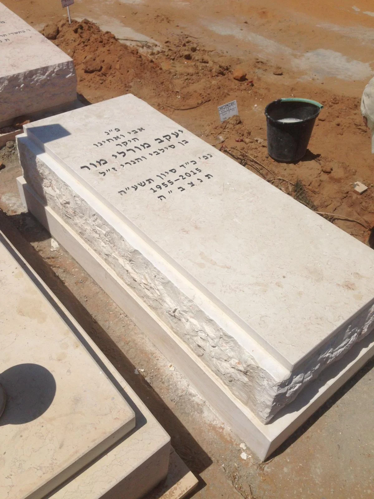
Straight Lines and Light Stone
This example uses straight lines and a broad central surface. Stepped edges frame the inscription without introducing a competing shape. It is a useful reference for a family seeking restraint, with most of the space devoted to the name and words.
Notice the margins around the text and the balance between the plaque and border. A clean design still involves choices about frame width, lettering size, line breaks and stone colour. Copying its outline without adapting the new wording can make the result feel crowded.
- What does the example show?
- A flat plaque, central inscription and stepped border.
- An idea to take from it
- Give the name and words prominence through layout and spacing.
- What should you clarify?
- Will your wording fit the available inscription area and plot dimensions?
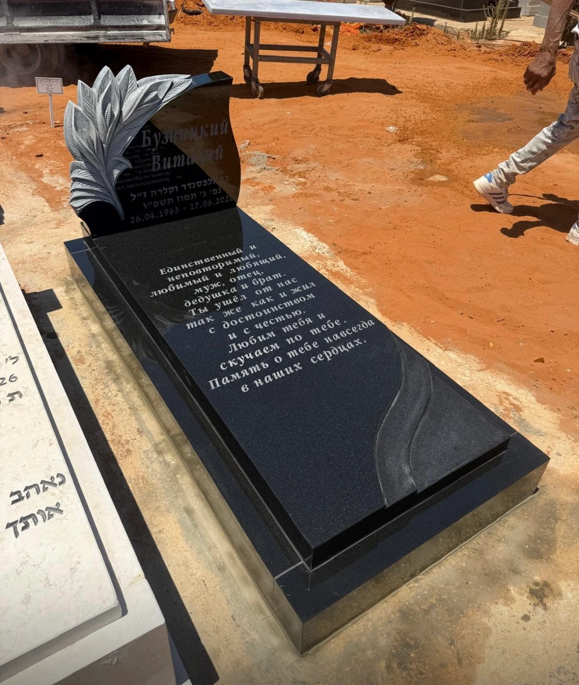
Dark Stone with a Sculpted Upright
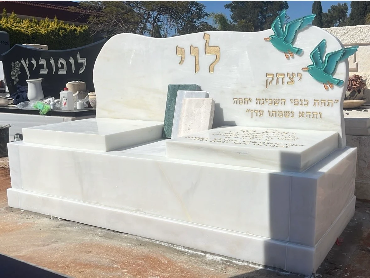
The upright here is more than a plain rectangle. Stepped lines at the top create movement against the elongated base. Light lettering stands out against dark stone, while the central surface remains largely clear. The composition balances an orderly base with one sculptural focal point.
If you like this direction, separate the colour from the upright's shape. Which appeals to you? Explore each independently; you need not choose every feature in the photograph to retain the idea that matters.
The photograph shows one angle. Before production, also discuss the sides, height and upright inscription. It cannot show how the same detail would look in another stone or at a smaller size. For materials and finishes, see granite memorials.
- What does the example show?
- Dark stone, contrasting light lettering and a sculpted upright.
- An idea to take from it
- Choose one focal point to give the memorial character.
- What should you clarify?
- Which stone and finish are proposed, and does the upright fit the permitted dimensions?
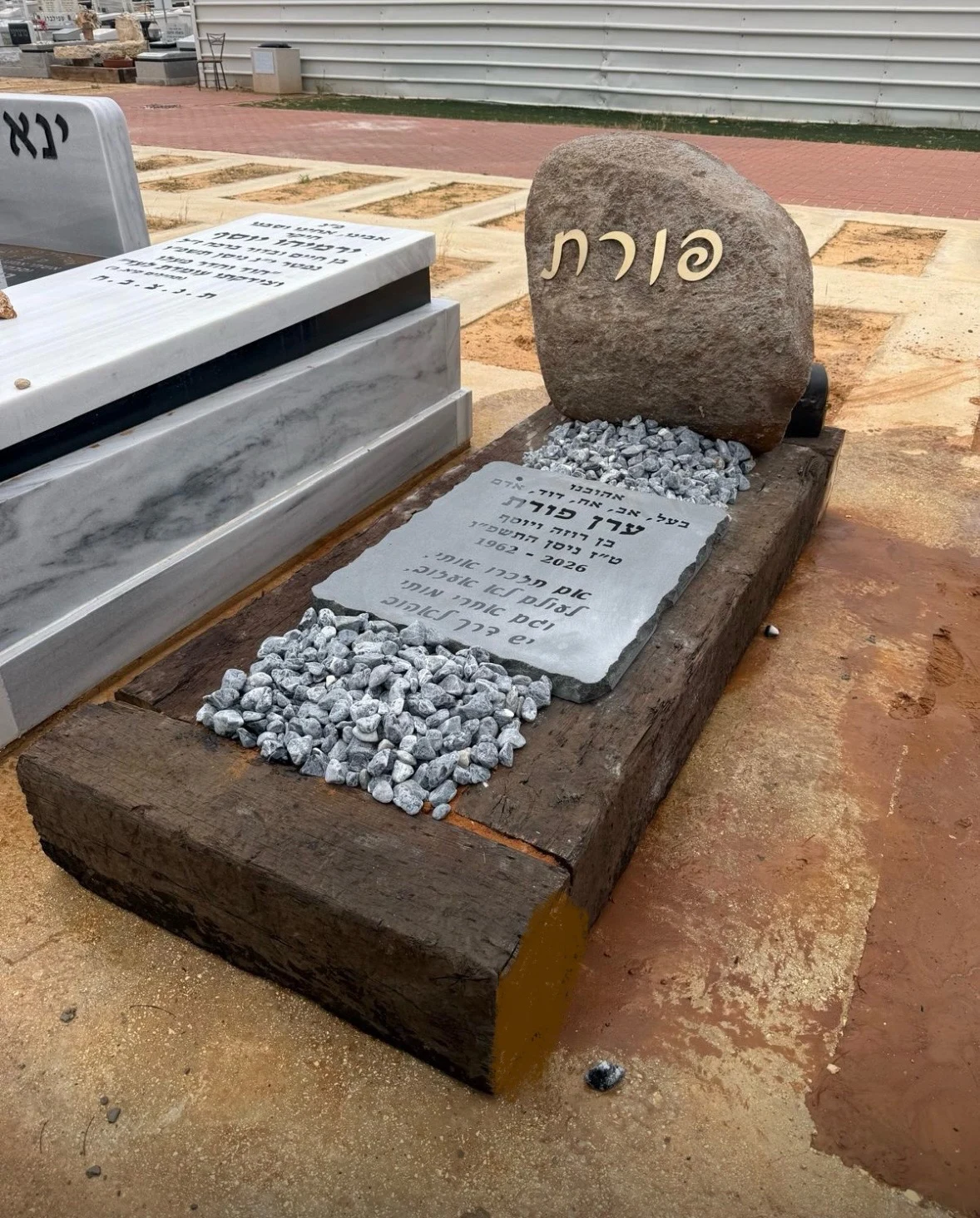
A Natural Boulder with Pebble Surrounds
Unlike a cut slab, this upright is asymmetrical. Its shape and warm colour complement the surrounding border, with light pebbles in the centre. The text is divided between the upright and another area, so consider both together rather than focusing only on the boulder.
For a natural design, selecting the actual block is part of the creative work. Another stone may be taller, wider or differently shaped. Agree what stays natural, what is worked and where the inscription goes. The same name and sentence will not fit every boulder identically.
A pebble area also needs specifying: its size, the separation from the lettering and how it will be cared for. In ourthe natural stone memorial guide includes further questions about choosing the block and texture.
- What does the example show?
- An asymmetrical upright with stone pieces used as part of the design.
- An idea to take from it
- Retain a natural silhouette alongside a defined inscription area.
- What should you clarify?
- Which block is reserved for the project, and how will the lettering sit on it?
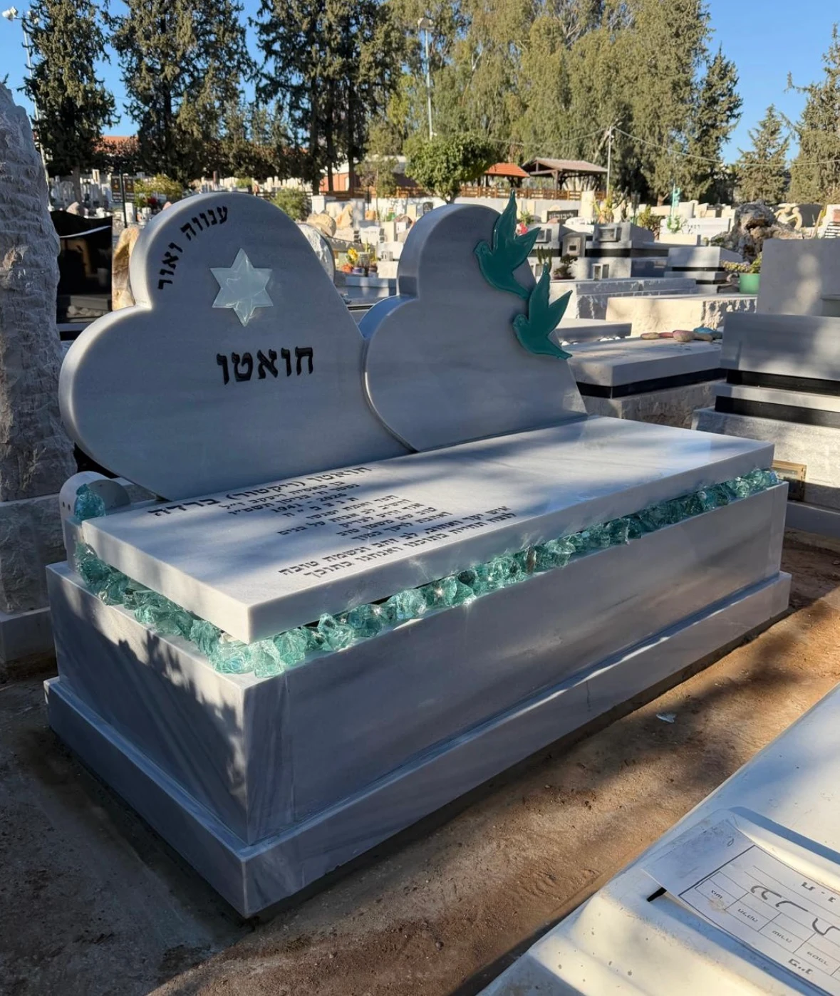
Two Heart-Shaped Slabs
The two heart-shaped uprights give each inscription its own recognisable frame while presenting one shared memorial. The broad lettering area needs careful spacing between names and a relationship between the two parts. This can express a shared memory while preserving each person's place.
The two inscriptions need not be equally long. Agree instead on shared features: font, name size, date order or frame shape. Consistent principles allow each text its own character.
Two names or two hearts in a photograph do not establish the burial arrangement. Check the plot type and conditions for a shared design separately. In ourthe double memorial guide explains the distinction between visual layout and site requirements.
- What does the example show?
- Two similar shapes joined in one composition.
- An idea to take from it
- A consistent design with a distinct place for each name.
- What should you clarify?
- What is the burial arrangement, and how much space does each text have?
Two Reddish Slabs on a Light Base
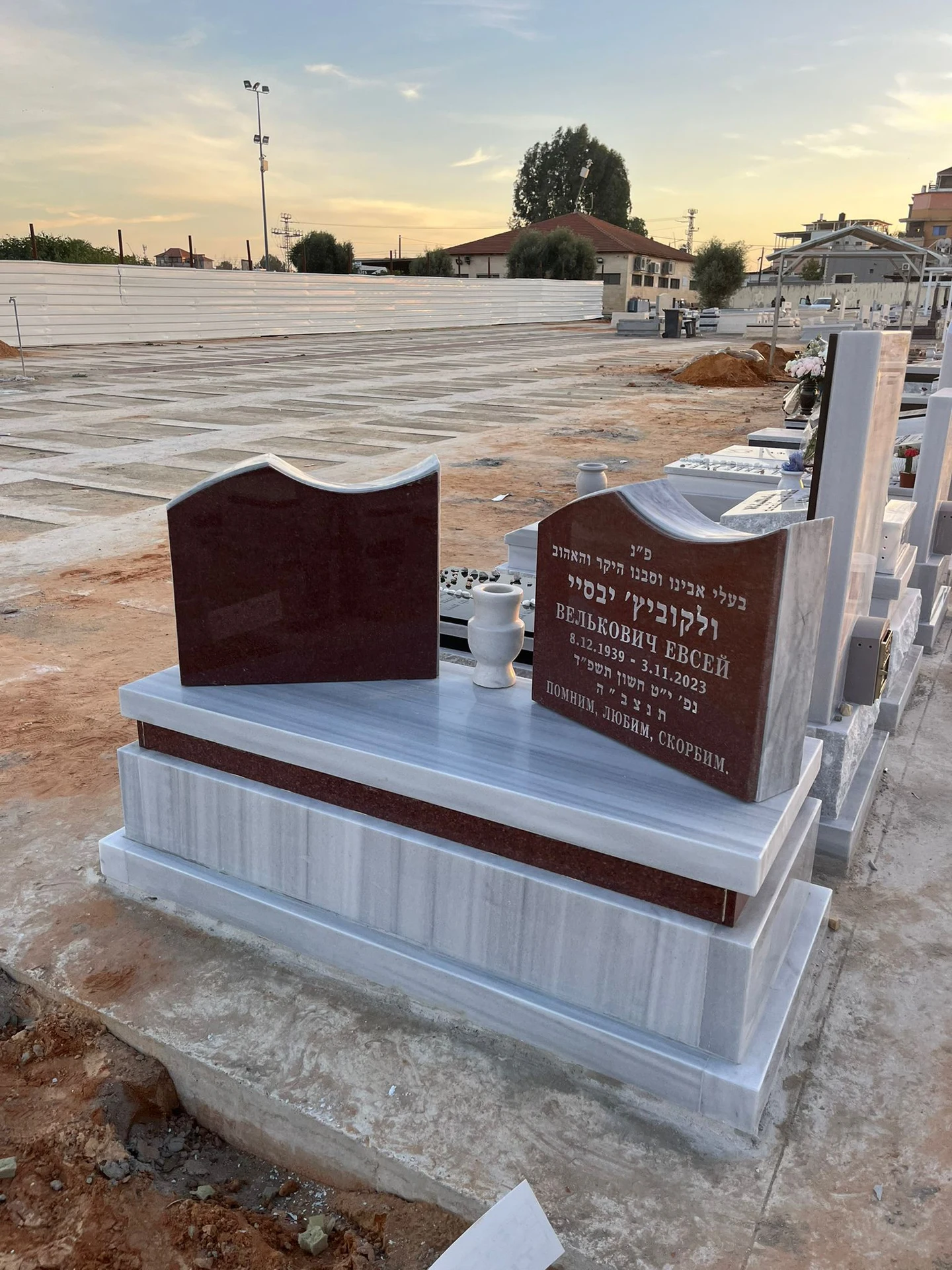
Here, colour and placement distinguish the two areas. Darker plaques sit above a light surface, with pale lettering on each. The example shows how two remembrance spaces can share a single design language.
View the colours together; separate material photos may not reveal their relationship. Check the lettering on the actual plaque and allow for a longer name or another language on either side.
If the project will be completed in stages, discuss future material matching. A trade name does not guarantee identical colour and pattern. The design can connect later components without promising an unverified exact match.
- What does the example show?
- Contrast between the inscription plaques and shared base.
- An idea to take from it
- Define areas through material and colour.
- What should you clarify?
- What does each material specification include, and will there be later additions?
A Butterfly and a Pink Detail
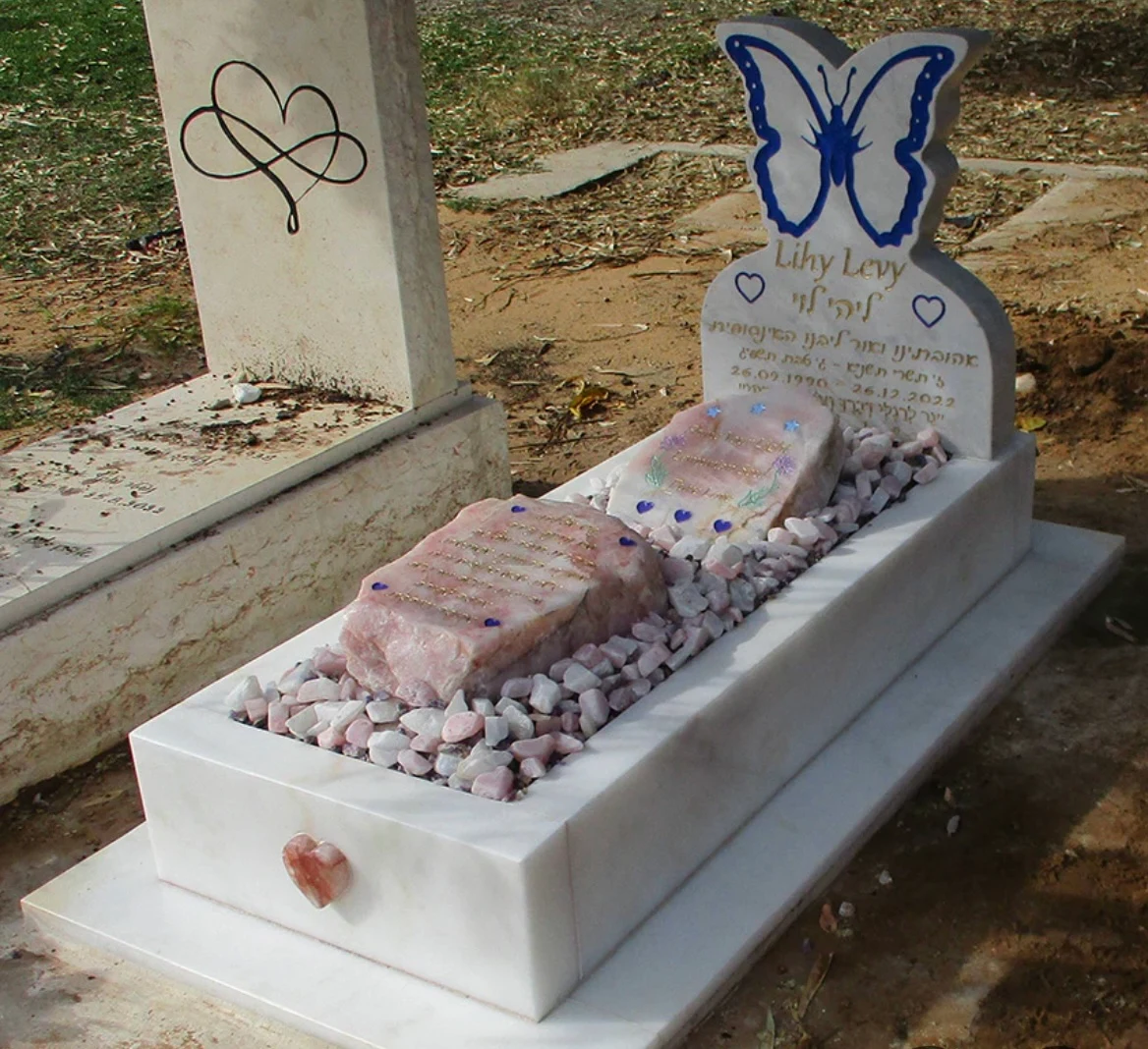
The butterfly draws the eye first, while the pink horizontal surface adds another accent. One symbol can shape the character of an entire memorial. Start with why it matters and how much emphasis it should have, rather than adding more decoration.
We should not infer a personal story from a photograph. It shows a design choice; the meaning of a similar feature in a new memorial comes from the family. The symbol could also appear as a small engraving or a subtler detail.
Consider the symbol and wording together. A long inscription needs enough clear surface after the decorative element is placed. Personal character comes from the relationship between parts, not the number of additions.
- What does the example show?
- A recognisable symbol and coloured details across the memorial.
- An idea to take from it
- Choose one detail that has meaning for the family.
- What should you clarify?
- How much inscription space remains, and how will the symbol be made?
A Headstone with a Motorcycle Sculpture
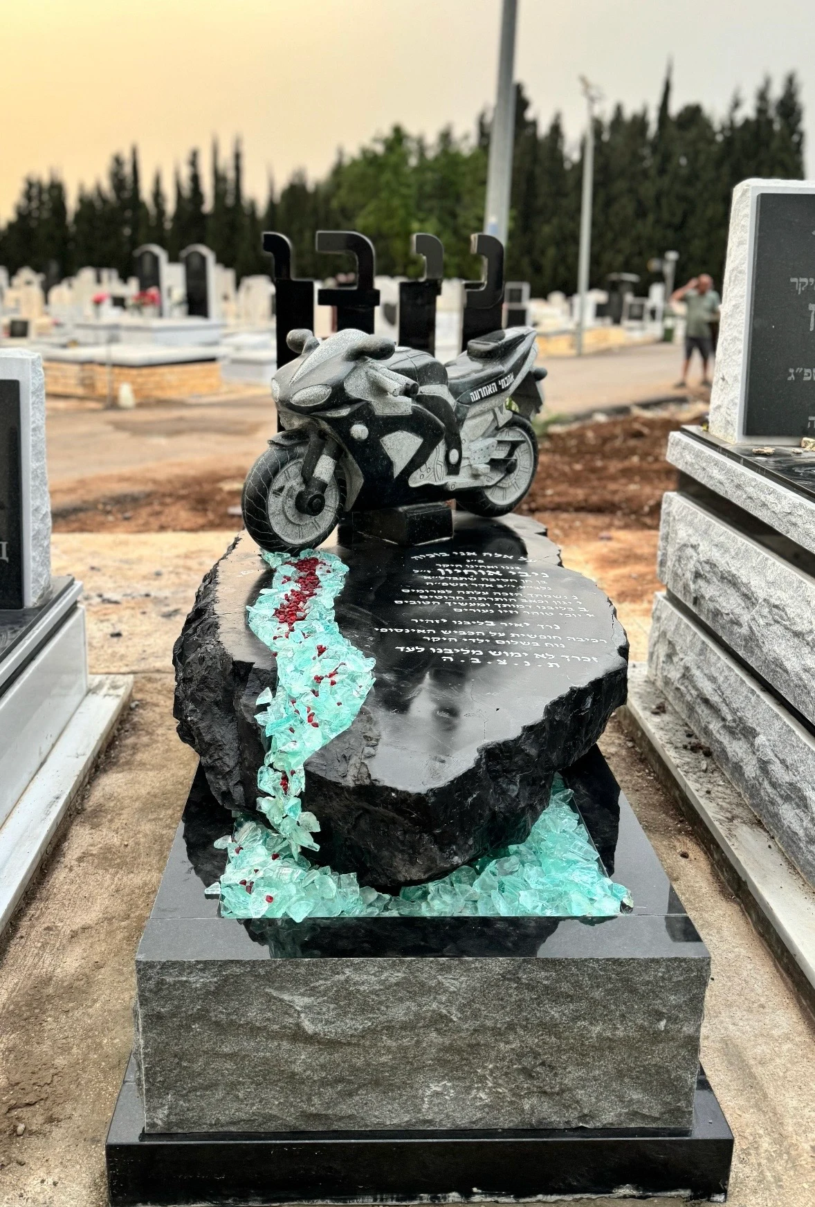
The sculpture here is a prominent three-dimensional feature that changes the memorial's silhouette, rather than a small illustration beside the name. The inscription sits below, with green details creating continuity along the base.
For a similar direction, consider more than the object itself: its prominence, appearance from every side, overall height and room for the name. Fabrication and fixing details require professional design; they cannot be read from the photograph.
A hobby or profession can also be expressed through a symbol, outline or engraving. Sculpture may suit one family, while a smaller motif better fits another family's wishes and budget. The guide tobespoke headstones offers a way to compare the alternatives.
- What does the example show?
- A three-dimensional personal feature as the focal point.
- An idea to take from it
- Express a hobby or memory through a defined design feature.
- What should you clarify?
- What can be made in the chosen material under the plot's conditions?
Blue Tones with a Rounded Upright
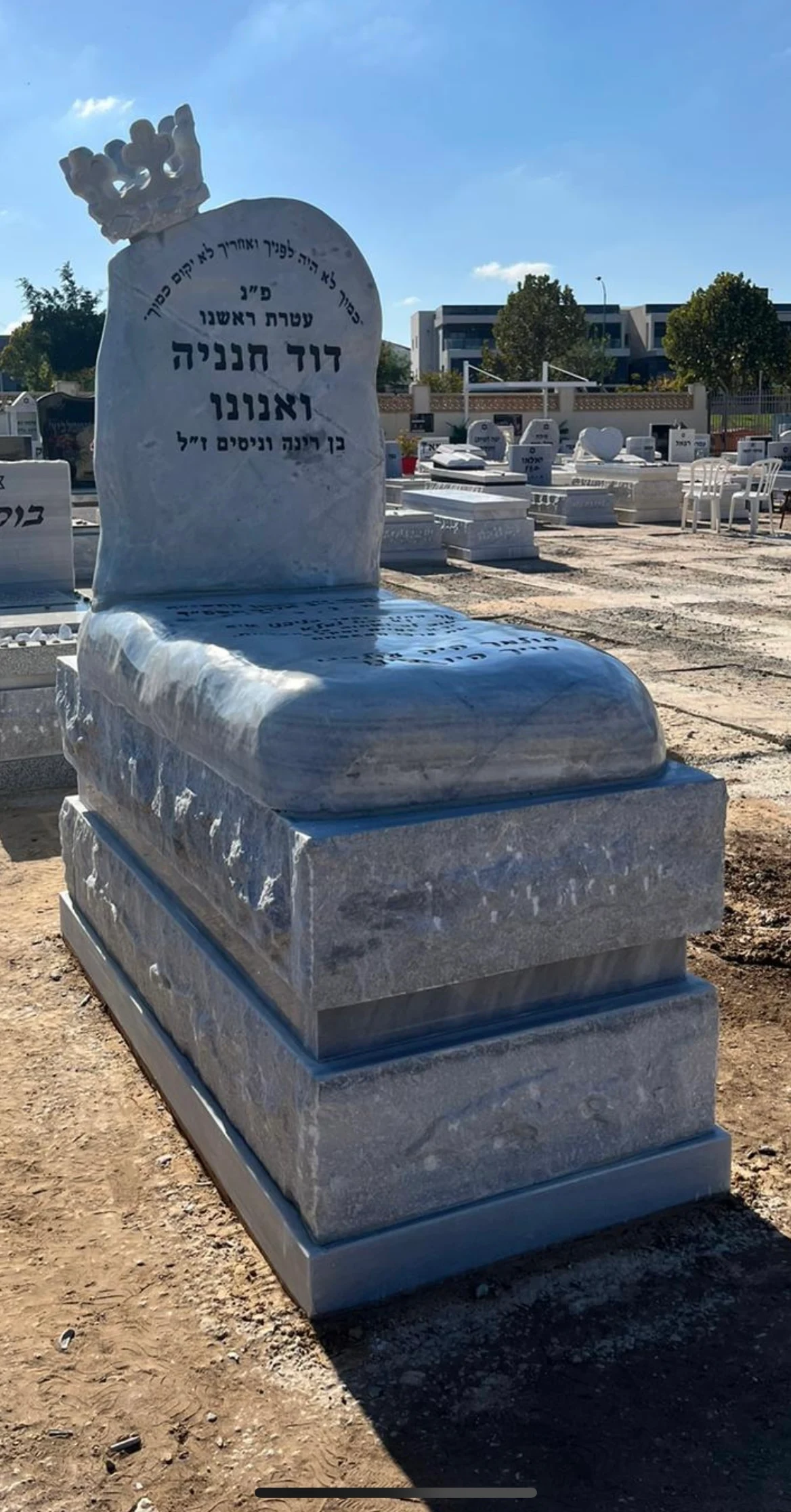
Colour is central to this example, and the rounded upright continues the lines below it. Notice the relationship between the inscription area and its border. Even with a striking colour, make sure the name and dates are not lost in the stone's pattern.
Screens and lighting affect colour. A photograph can help you choose a blue or grey direction, but it cannot approve the final material. View the proposed stone and discuss any variations in shade or pattern.
If the curved outline is what you like, consider it separately from the colour. Identifying each preference lets Rubi suggest options that fit the plot and scope while retaining the feature that first appealed to you.
- What does the example show?
- Blue tones, a rounded upright and a border around the inscription.
- An idea to take from it
- Combine curved lines with readable lettering.
- What should you clarify?
- What is the actual material, and how does your text look on it?
When You Like Details from Several Designs
You may like the colour of one example, the upright of another and the lettering of a third. Note the important feature beside each photograph, then rank your priorities: what must stay and where you can be flexible.
Ideas from different photographs need to become one coherent design. An upright balanced on a wide base may not suit a narrow one; a large symbol changes the lettering space. The maker should check the combination and explain the changes, rather than promise an exact copy of several different photographs.
Keep a small selection
Choose up to three different photographs rather than a folder of near-identical options.
Explain what you like
Shape, colour, lettering or a personal detail: one short note per photograph.
Add the practical details
Cemetery, known burial type, preferred date and budget.
Request a design proposal
Check what can be retained and what needs adapting, then prepare the specification.
Questions about the Designs Shown
Does every example suit every cemetery?
Check the cemetery's rules for your specific plot. Another completed work can inspire the design, but does not replace approval of dimensions, materials and plans.
Can a photograph tell us the price?
Not accurately enough to place an order. Pricing needs material, dimensions, inscription, additions and installation details. Send a photo to begin discussing what information is needed for a quote.
Can we use the design without copying the photographed inscription?
Yes. The examples illustrate design. Names, dates and personal words are prepared for your family; you need not adopt the inscription in the photograph.
Is a simple design an option?
Certainly. Straight lines, light stone and a carefully arranged inscription can be an excellent starting point. The care can lie in the material, proportions and execution, without a large sculpture.
What should we send Rubi?
One or two photos, a short explanation of what you like and the burial location if known. We can talk even if your preferred direction is still taking shape.
From Photographs to Your Own Design
If an example helped you identify a direction, save its style name or mention its heading when we talk. You do not need every decision ready. Tell us what reflects the person, what your family likes and which constraints are already known.
inheadstone catalogue Continue by stone or design type. If you are comparing several examples, the guide to comparing memorial photographs will help organise your choice. Rubi can adapt the idea to the plot, lettering and budget in a free consultation with no obligation.
Have a question about your headstone?
Ask Rubi about stone, inscriptions and options, free and without obligation.
Related information
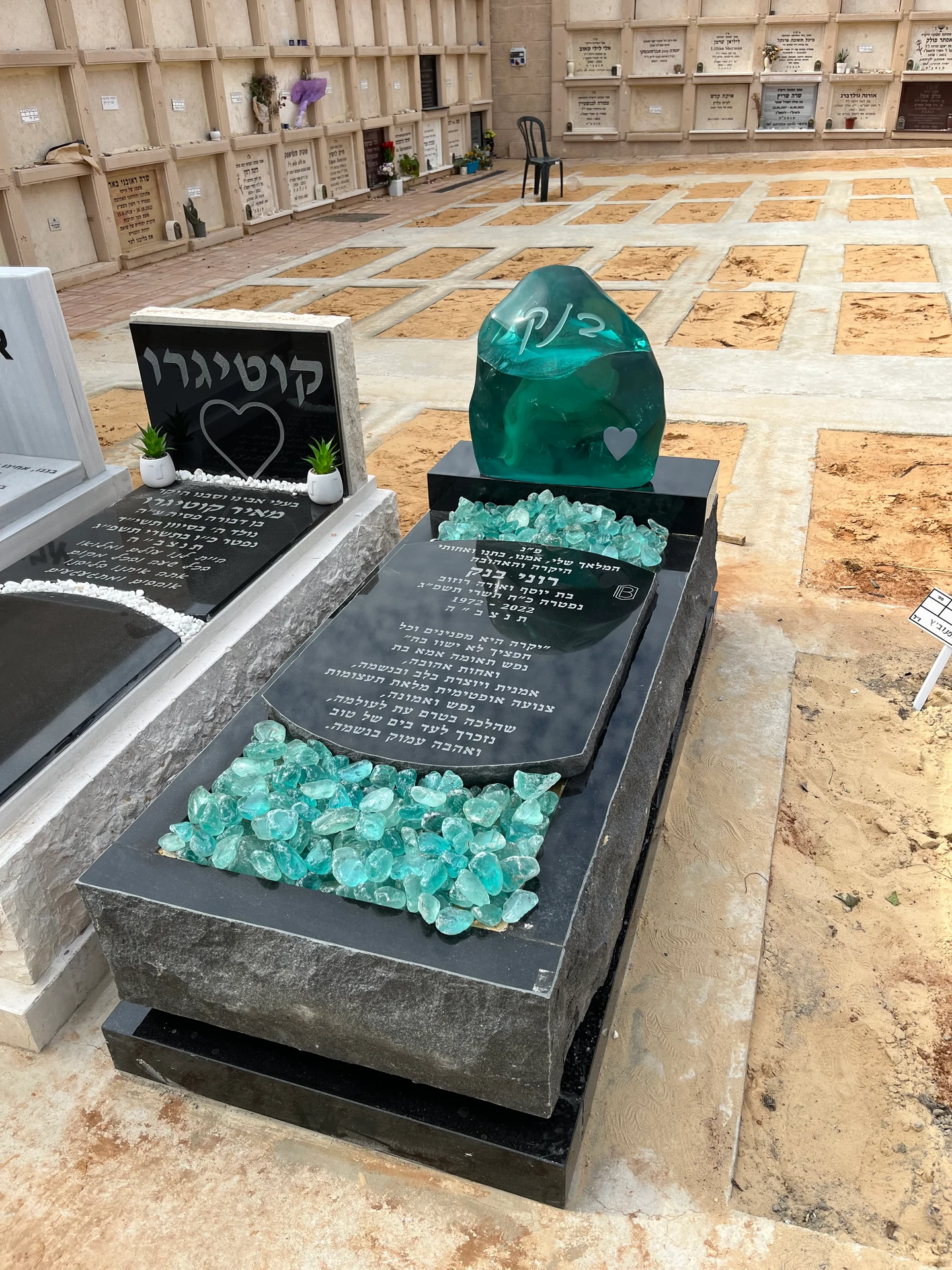
Comparing Headstone Designs: How to Find the Right One
Compare headstone photos, choose stone and shape, allow room for the inscription and adapt an example to your plot and budget.
Read the guide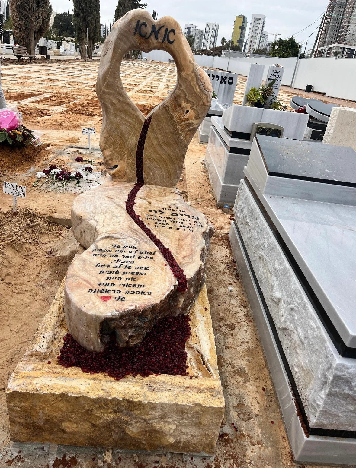
Bespoke Headstones: From a Personal Idea to a Work in Stone
Bespoke headstone design with examples from Rubi: develop an idea, combine sculpture and materials, preserve legibility and work within your budget.
Read the guide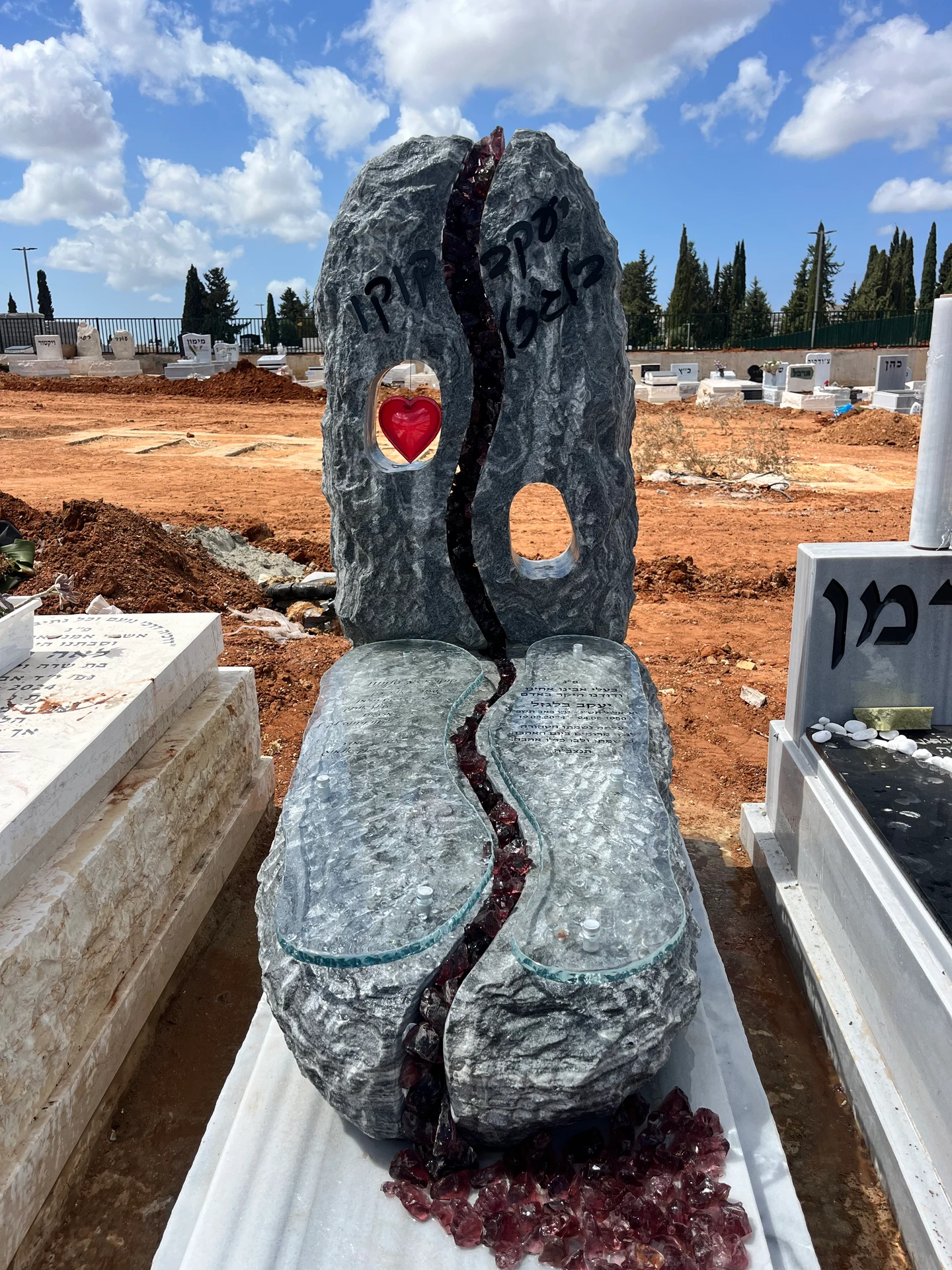
Headstones Explained: Types, Stone, Design and Pricing
Explore headstone types, materials, designs, double and double-depth memorials, inscriptions and restoration. Photos and detailed comparisons help you choose for your family.
Read the guide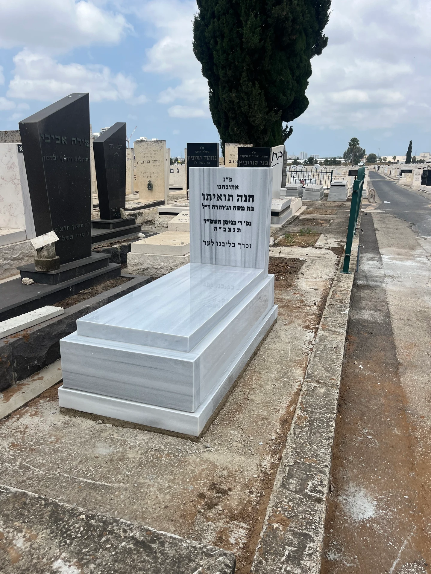
Headstone Prices: What Does a Headstone Cost, and What Is Included?
Headstone prices depend on stone, dimensions, inscriptions and installation. Learn to compare quotes, recognise extras and plan within your budget.
Read the guide